Monitor calibration
How to calibrate your monitor to the sRGB color space (more or less) without any special tools.
Note: This article was written way back in 2003, and things have changed quite a lot. The calibration charts are still useful for roughly calibrating TVs and projectors and the like, but there are better approaches to monitor calibration these days, and most decent monitors come pre-calibrated from the factory.
Also, these images only work correctly if they are displayed at a 1:1 pixel scale. Many combinations of newer monitors/operating systems/etc. — notably “high-DPI” or “Retina” displays — end up resampling images to display at a different pixel scale. This is fine for displaying most images, but these images will not work correctly when resampled. If you want to use these images for calibrating a display, please make sure they are displayed at 100% scale and that your monitor is set to a 1:1 pixel scale!
Nowadays my preferred method for calibrating a monitor is with a ColorMunki Smile (affiliate link). For a software-only approach on macOS you can try SuperCal, which is much more comprehensive than the built-in display calibrator.
Introduction
One of the big problems in computer displays is a lack of consistent response between different monitors, as well as other input and output devices (such as scanners, printers, digital cameras, etc.). A result of this lack of standardization is that colors which look fine on one device might look totally different on another device.
Because of this problem, a number of imaging manufacturers, such as Epson and Hewlett-Packard, got together and defined a single standard, sRGB, for computer-based devices to conform to. The standard is pretty comprehensive, and involves calibrating every device to what can be summarized as an RGB-based colorspace with a white-point of 6500K with an overall gamma of 2.2.
Of course, that description totally flies over most peoples' heads, and some of the other factors (such as ambient and direct room lighting, phosphor response, and so on) make the standard extremely difficult for casual end-users to stick to.
Fortunately, the most important part of the standard — a gamma of 2.2 — is fairly easy for even a casual end-user to calibrate their monitors to, and by performing that part of the calibration, users can at least be sure that colors will look more or less consistent across different displays, in terms of brightness and overall coloration.
What this page does
This page guides you through the steps to calibrate your monitor for γ=2.2 (or the less-common γ=1.8) on systems which allow you to modify your gamma correction factors. It will help you to see web content with the same brightness and color reproduction that other people see it as, assuming they have performed a similar calibration. (Yes, this is a bit circular.)
It will also help with reproduction issues, such as printing out images you have created on your computer onto a calibrated printer. Although the colors will not match perfectly, they will still be much closer than with an uncalibrated display.
Although gamma is the most important factor for color reproduction, it is not the only factor. This page includes optional instructions to help you to calibrate your whitepoint (i.e. the color tone which white corresponds to, as “white” is not absolute), though that’s still fairly sensitive to room lighting and so on. It is not intended to bring your display up to spec for colormatch-intensive environments such as professional print shops and so on, since that requires major environmental overhauls as well.
What you need
In order to calibrate your screen, you need some way of determining whether two colors are the same brightness (your eyes are probably good enough, even if you’re colorblind). A way of blurring your perception of the colors helps, too, if you’re like me and have such good eyesight that you can make out the individual pixels on your display. Cheap tracing paper pressed against the screen or wearing your resident nerd’s Coke-bottle glasses are good choices (though the second one will probably give you a headache pretty quickly).
Additionally, you need a way of adjusting the display gamma. The operating systems I know about are as follows:
- Windows: Gamma controls are usually stored on a tab on the Display control panel, but this is driver-dependent (also, note that Windows 7 and later has a pretty good calibrator built-in)
- macOS In System Preferences, go to “Displays” then “Color,” then click “Calibrate”
- XFree86 (Linux, FreeBSD, etc.): if your desktop environment doesn’t have any sort of control panel for display gamma, try the command line
xgammatool
In some rare cases, a monitor may have gamma-correction controls of its own. If this is the case, set your computer to output its default gamma curve (which is probably 2.2 already) and use the monitor’s controls instead, and only use the computer’s controls if the monitor’s controls don’t have enough range for the calibration tests (but do use your monitor’s whitepoint controls if available).
Whitepoint (optional)
For this part you need some actual physical materials, namely a sheet of paper, an opaque backing for the paper (such as black posterboard or construction paper), and a light. Preferrably both of these will be 6500K (also sometimes referred to as D65); typically you can find calibrated paper and lighting at your local art supply store. If not, get the whitest paper you can find (usually your typical photocopier paper will be fine) and the whitest light (such as a halogen or a compact fluorescent). Be sure to have an opaque backing behind the paper; otherwise the monitor’s color will affect the paper’s color. (The backing isn’t necessary if the paper is opaque, but most papers aren’t.)
Place the paper next to the white box in the next section, and shine the light on the paper (but not on the screen); it may help to use something opaque to block out the light which hits the screen. Turn out all the lights, close all the windows, and so on — try to get it so that the only light shining on the paper is your calibration reference light.
Then, adjust the brightness and color temperature of the monitor until the paper and monitor’s white are the same (it usually works best to start with brightness).
Gamma
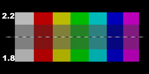
Bring up your gamma correction controls. Adjust the overall gamma until the middle and top sections of the grey square on the left are the same brightness. It helps if you defocus your eyes a little bit.
Then adjust the individual red, green, and blue gamma values until the respective sections of the red, green, and blue rectangles match up. (If you have difficulty with the blue one, get red and green correct and then work on blue using the magenta swatch instead.)
If all went well, the region corresponding to your calibration target should all be of a consistent brightness when viewed at a distance (or with your eyes defocused, or wax paper in front of it, or whatever). If so, congratulations, your monitor is calibrated. If not, oh well; you tried your best. Such is life.
Final notes
This is only a very rough calibration which only handles a single midpoint (which is enough for CRTs but typically not very good for LCDs), and even if two monitors are perfectly calibrated as best as possible they may still differ somewhat due to a number of factors. This process will at least ensure that your hues and brightnesses will be more or less consistent with the average viewer experience, though.
Also, while it’s gotten a lot better since I wrote this in 2005, a lot of older input devices (scanners, digital cameras, etc.) provide their data in linear RGB, rather than sRGB, and it is still the case that a lot of programs (even Photoshop!) do their computations assuming linear RGB, and so on. So, if you have an image where the colors look really damn weird (especially purples and oranges coming out as blue and red instead), try applying a gamma correction of 0.454 to it.
Comments
To see the comments on this entry, please log in. Alternately, send me an email, or join me on Discord!